LOST & FOUND
Location: Dundee Design Festival 2024
Curator: Stacey Hunter
Photography: Grant Anderson
Date: September 2024
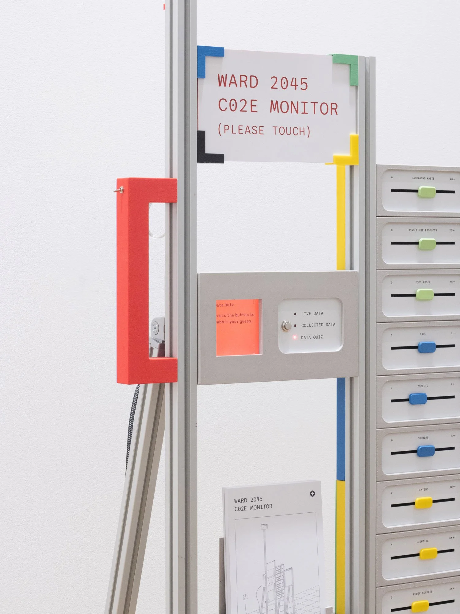
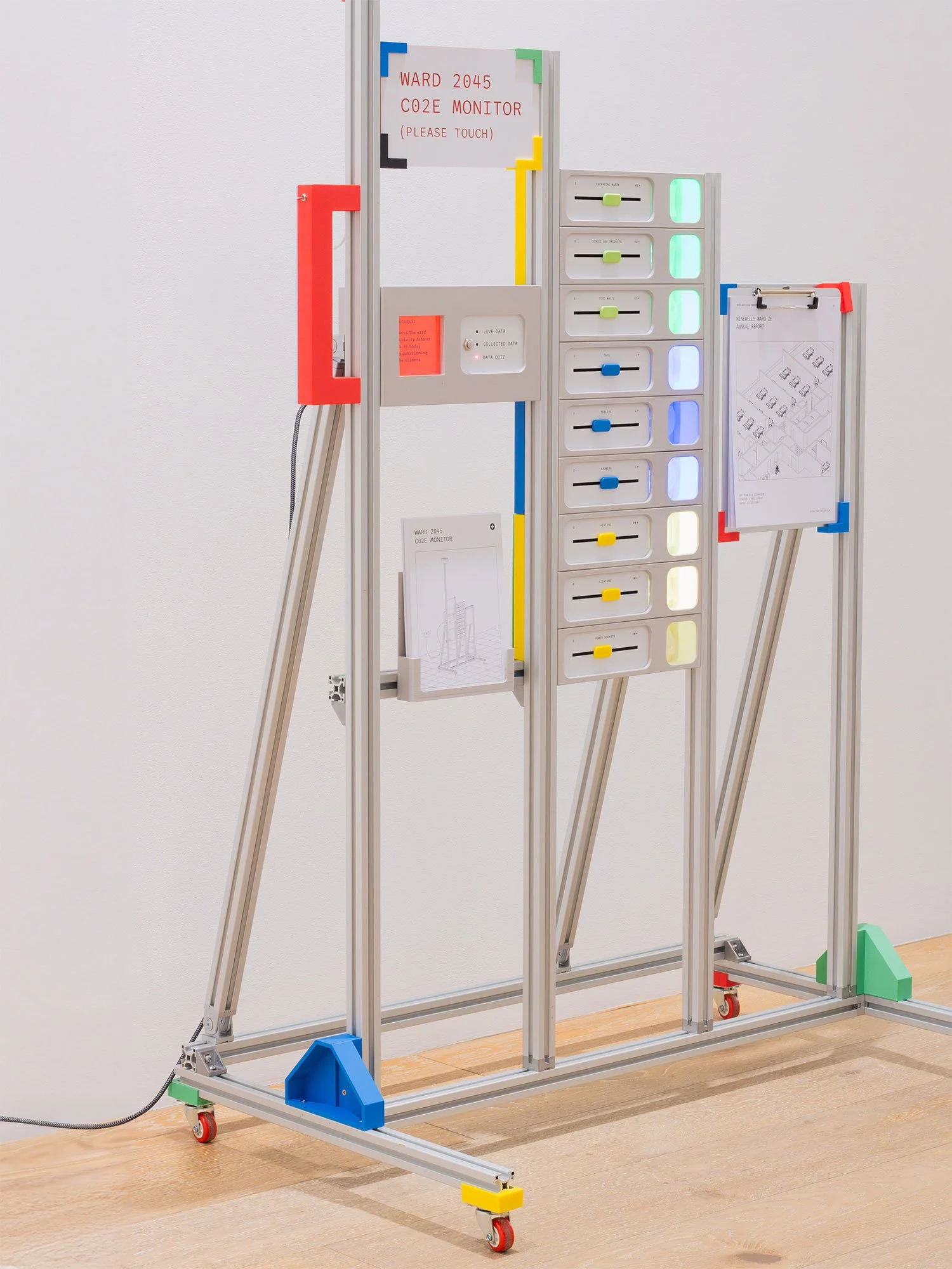
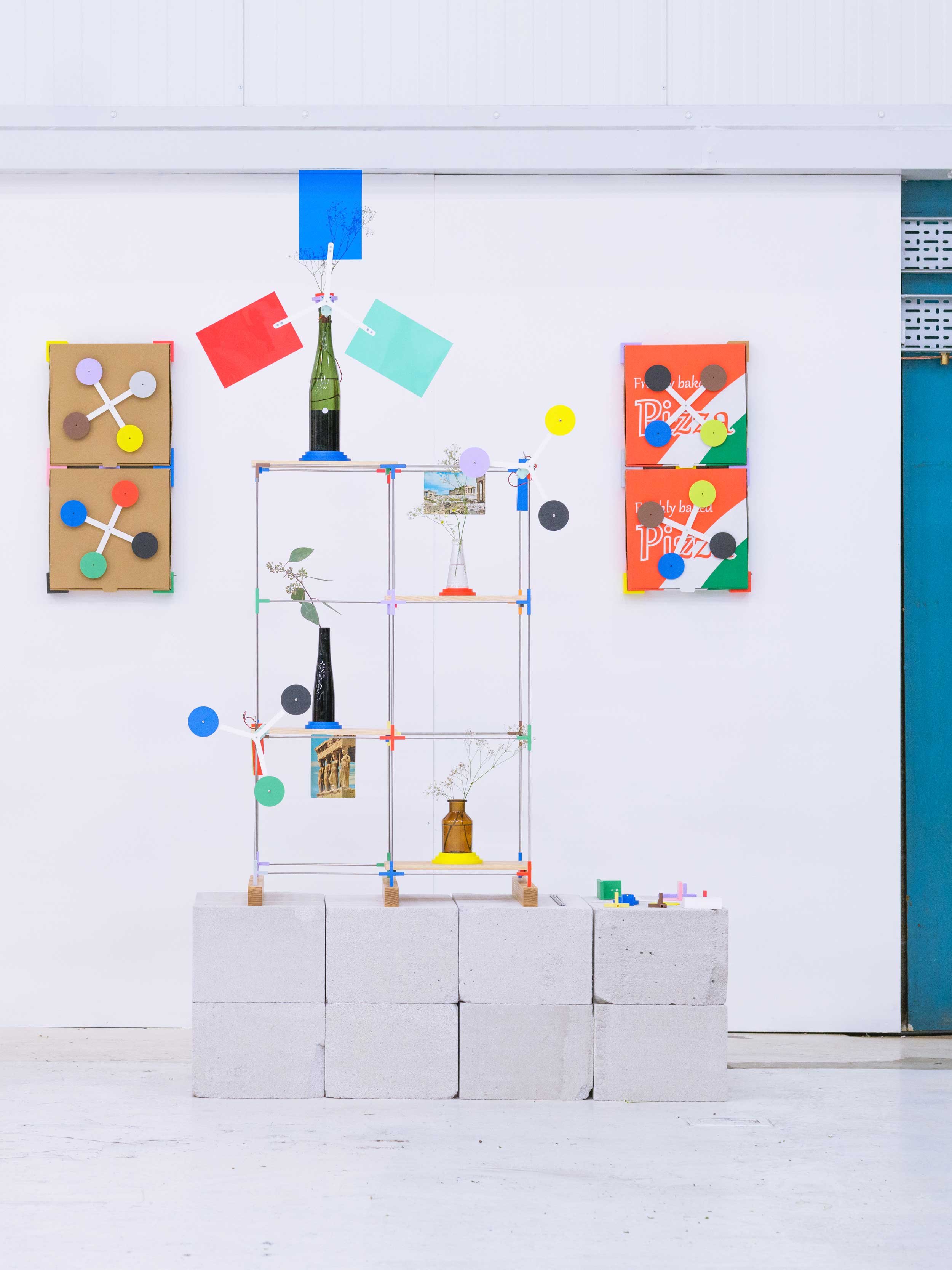
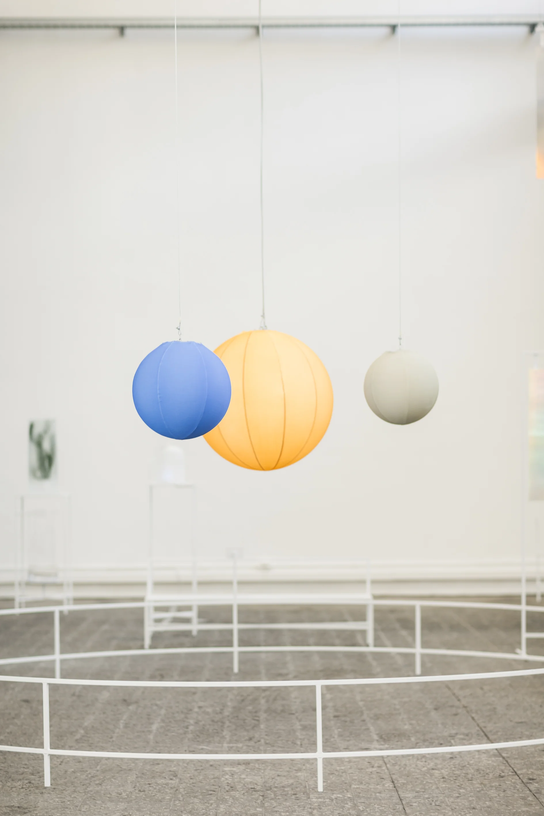
In an era where we are grappling with the dual concerns of wastefulness and unfettered technological progress, Lost and Found casts light on the creative potential of hybridizing the old and the new. In response to the Dundee Design Festival theme of multiplicity Lost & Found looks to things recently defunct, be they considered wasteful, obsolete or undervalued, and re-imagines their potential in encounter with 3D printing.
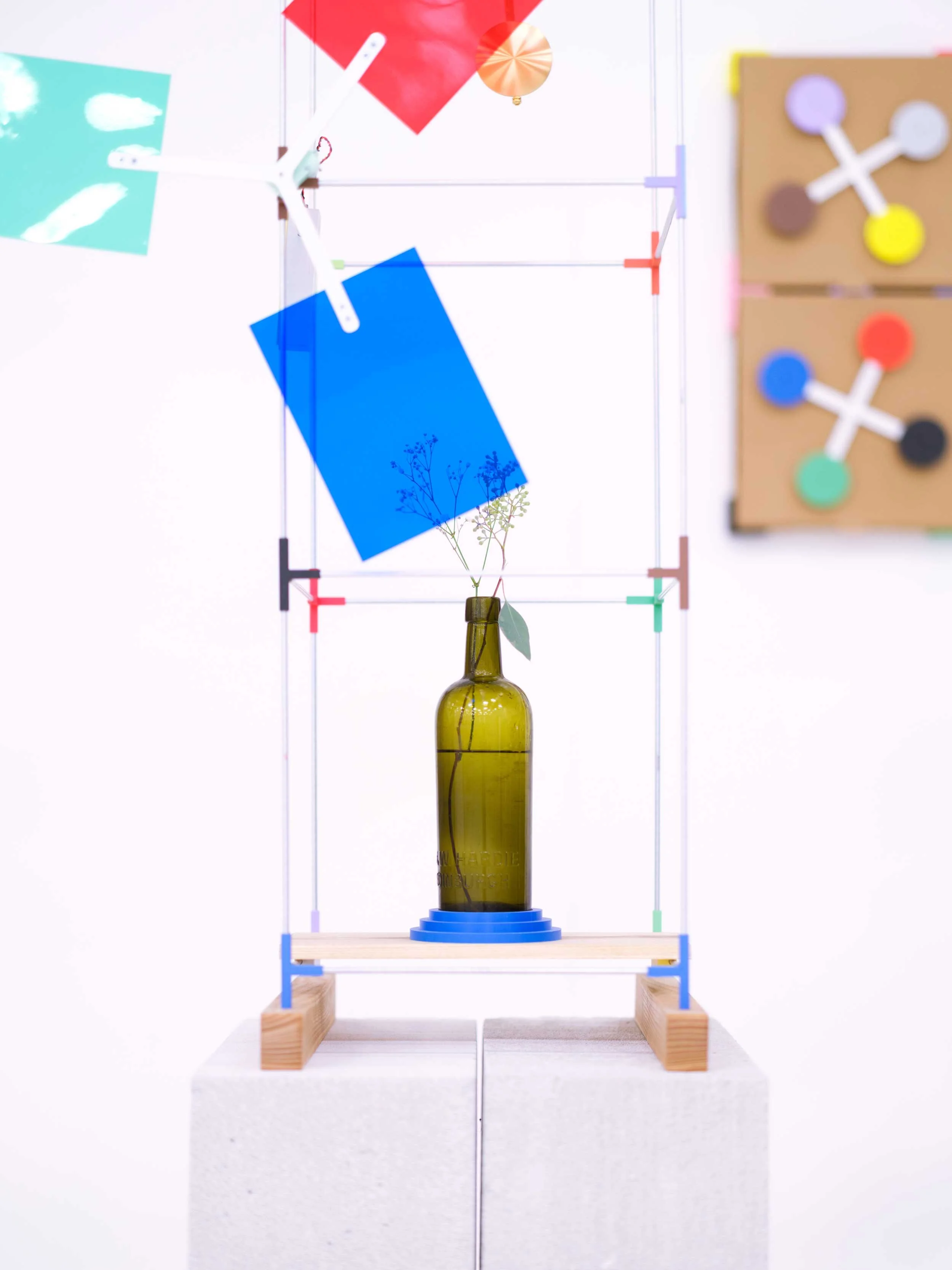
The ongoing series of installations and consumer electronics products are composed from diverse types of ephemera (postcards, pendulums, glassware, flora, pizza boxes) contained within a highly adaptable and re-usable framework of 3D printed components animated with mechanical movement and flourishes of bold colour. As well as being materially resourceful the pieces are created to also be logistically resourceful in terms of install, transportation and de-install - where the entirety of the installation can be transported inside a suitcase, eliminating the need for freight transportation.
Overall Lost & Found aims to depict an eclectic, resourceful and alternative vision of now that pieces together technologies and antiquities. In doing so it invites us to value the accumulative power of harmonizing the past and present, as a critique of a wasteful and resolutely futuristic tomorrow.
RESERVOIR RUG
Client: Taiping
Design: Dean Brown (Fabrica)
Photography: Paul Graves
Date: May 2013
Reservoir Rug takes inspiration from flowing water - collecting in a series of wall mounted containers, falling fluidly from one to another, eventually pouring out onto the floor and rippling into a deep pool. The concept is inspired by the depth and subtlety of the textile production and expresses the natural potential of a carpet to move gracefully from the wall to the floor, where it typically belongs. Reservoir Rug is part of of a carpet collection by Fabrica Design Department for Tai Ping, exhibited during Paris Designers Days 2013.
MOBILE MUSEUM
Design: Dean Brown & Philip Bone (Fabrica)
Photography: Gustavo Millon
Date: April 2011 - April 2013
The Mobile Museum is a traveling museum, with contents contributed by people from all over the world. A flatpack timber and steel construction combined with a 2.4 x 1.8 metre footprint enables exhibitions to pop-up, pop-down and move on quickly and easily.
The Museum collection is redefined with every new location exploring curatorial themes that resonate with a sense of place - including family, money, friday, tomorrow and authenticity. The exhibits were selected in response to these themes from an open call to artists, designers and photographers. Since its origins in April 2011 the Mobile Museum was been hosted in Milan, London, Brussels, Helsinki, Luxembourg, Beijing and Hong Kong.
UNIQLO HEATTECH
Client: Uniqlo
Design: Dean Brown with Anyways
Photography: Joshua Preston
Date: January 2017
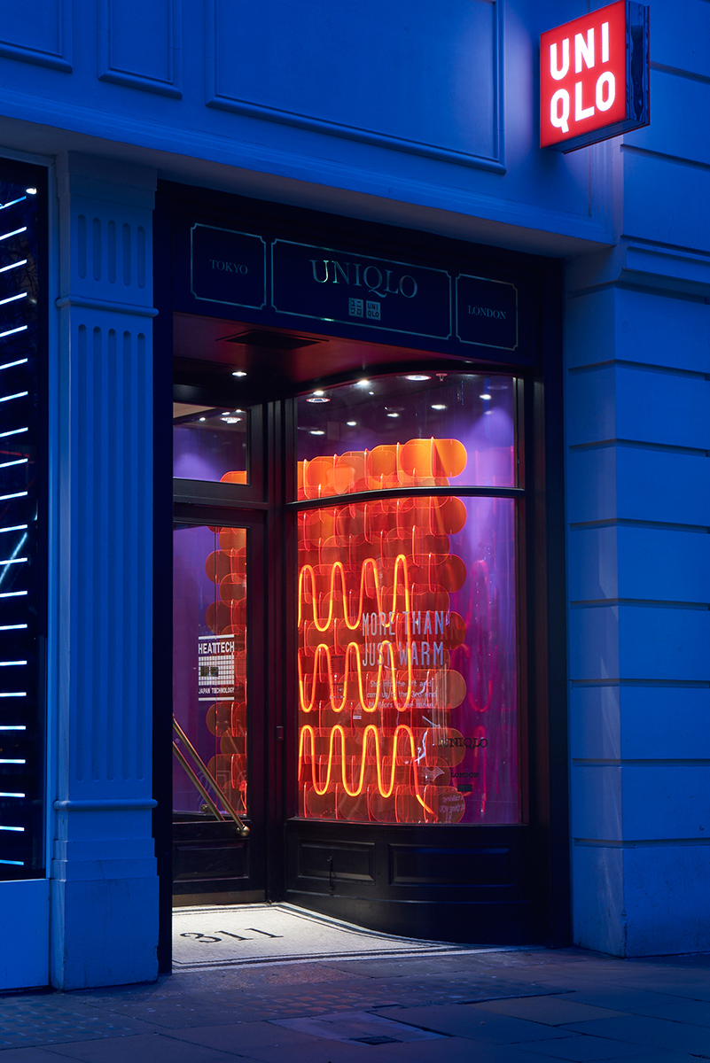
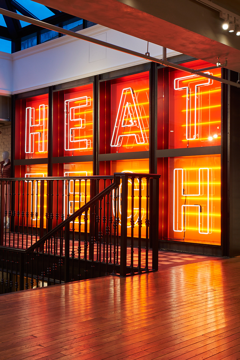
A series of Interior installations for Uniqlo's UK Flagship Store that celebrated the HeatTech Range. We partnered with the creative agency Anyways to deliver a warm and engaging retail experience that lead shoppers from street level to the concept Attic. The three key areas - Window, Title Wall and Display Tables struck a balance between evocative and informative. Shoppers were invited to bask in the warmth of HeatTech whilst learning about its technical benefits.
GOOGLE: DIGITAL EASEL
Client: Google
3D Design: Dean Brown
Interface Design: Google Creative Lab
Date: June 2018
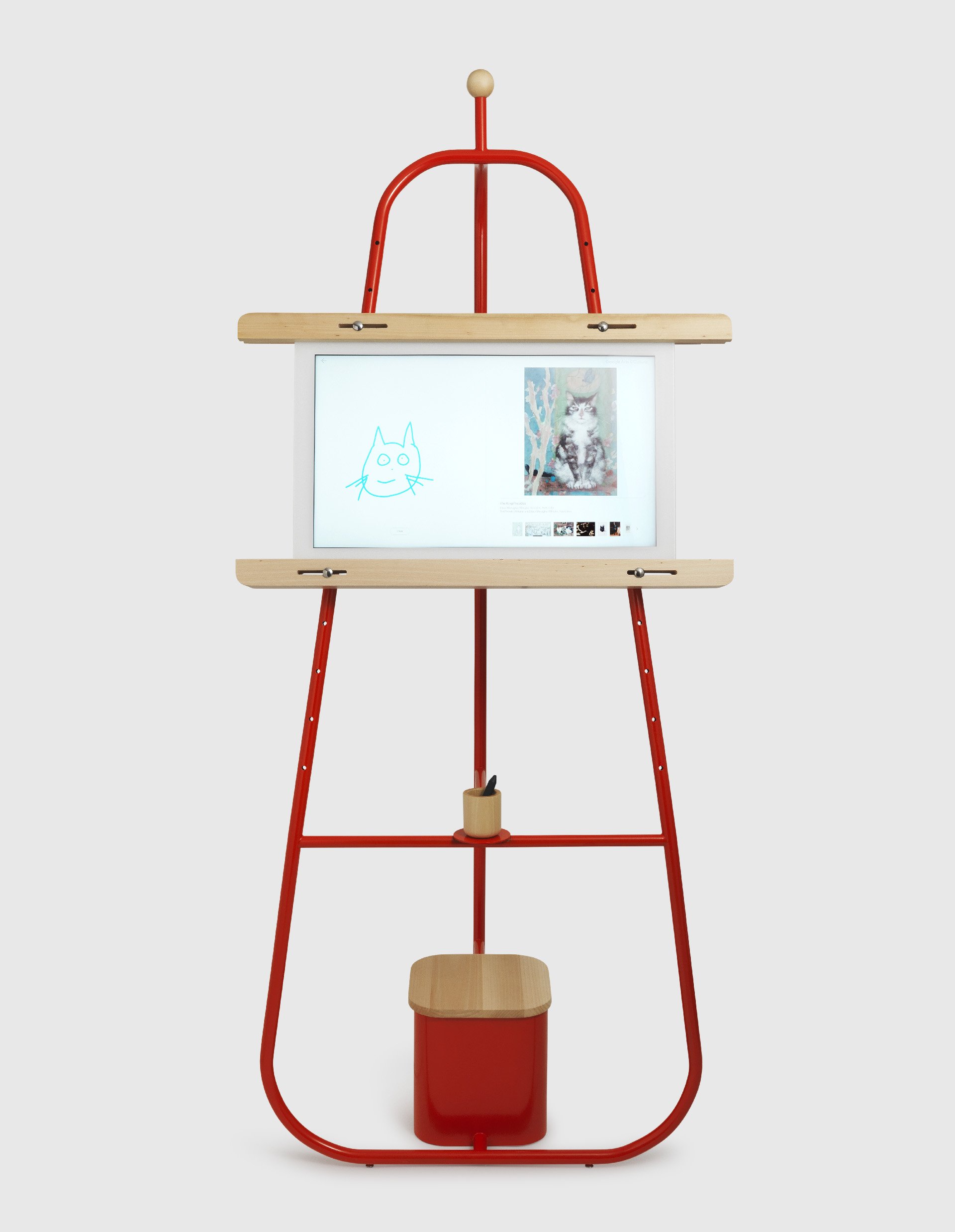
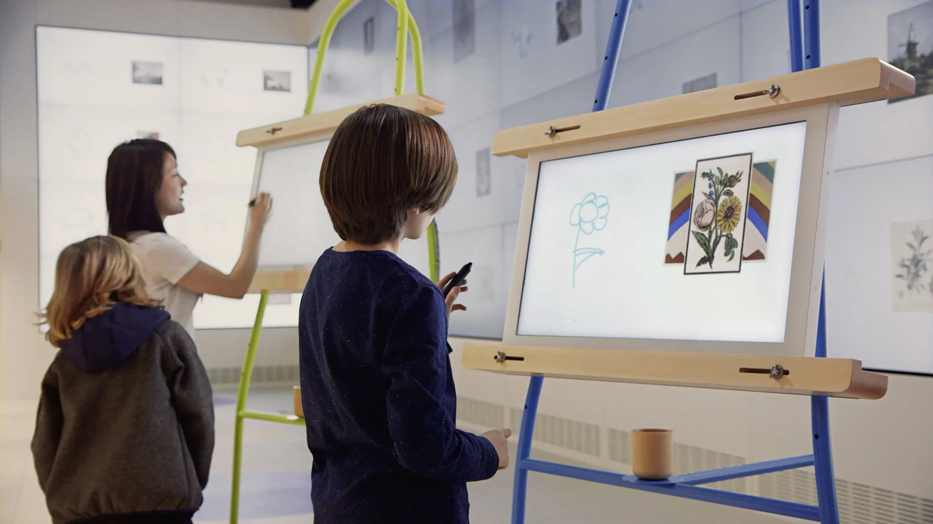
We partnered with Google Creative Lab to create a series of Digital Easels; which formed part of a public installation – showcasing a unique drawing experiment. The series we developed was approachable and informal - inviting to be drawn upon by adults and kids alike.
Whimsical in concept, yet rigorous in manufacture, the Canvas embraces the demands of public events - structurally robust, yet compact and movable. The design is sympathetic to tech integration, discretely accommodating power, cabling and cooling elements within its ventilated base unit.
The design references the silhouette of the classic painters easel, with hardwood detailing and a height adjustable canvas mount to accommodate drawing from a sitting or standing position. These time honoured features are juxtaposed with tubular steel, as a nod to the technical in a device that ultimately celebrates the future potential of drawing.
HOT & COLD
Client: Daikin
Photography: Shek Po Kwan
Design: Fabrica Design Team
Date: April 2014
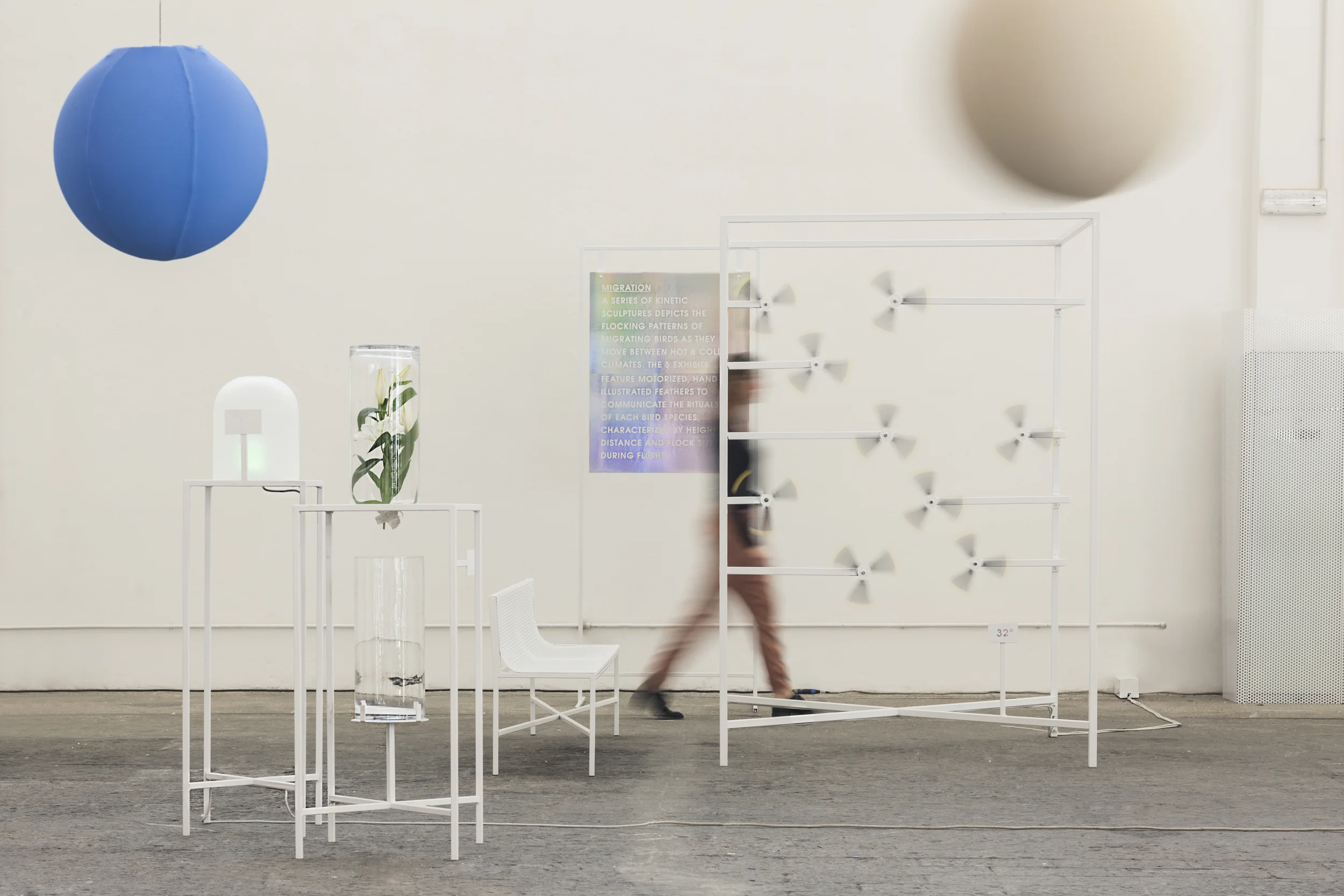
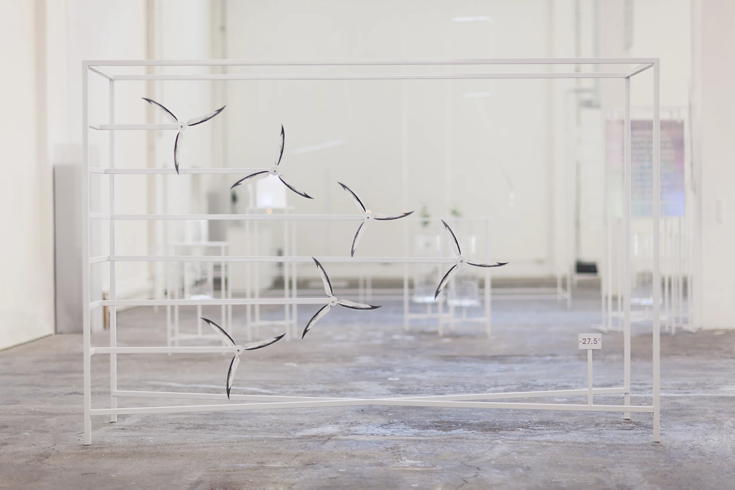
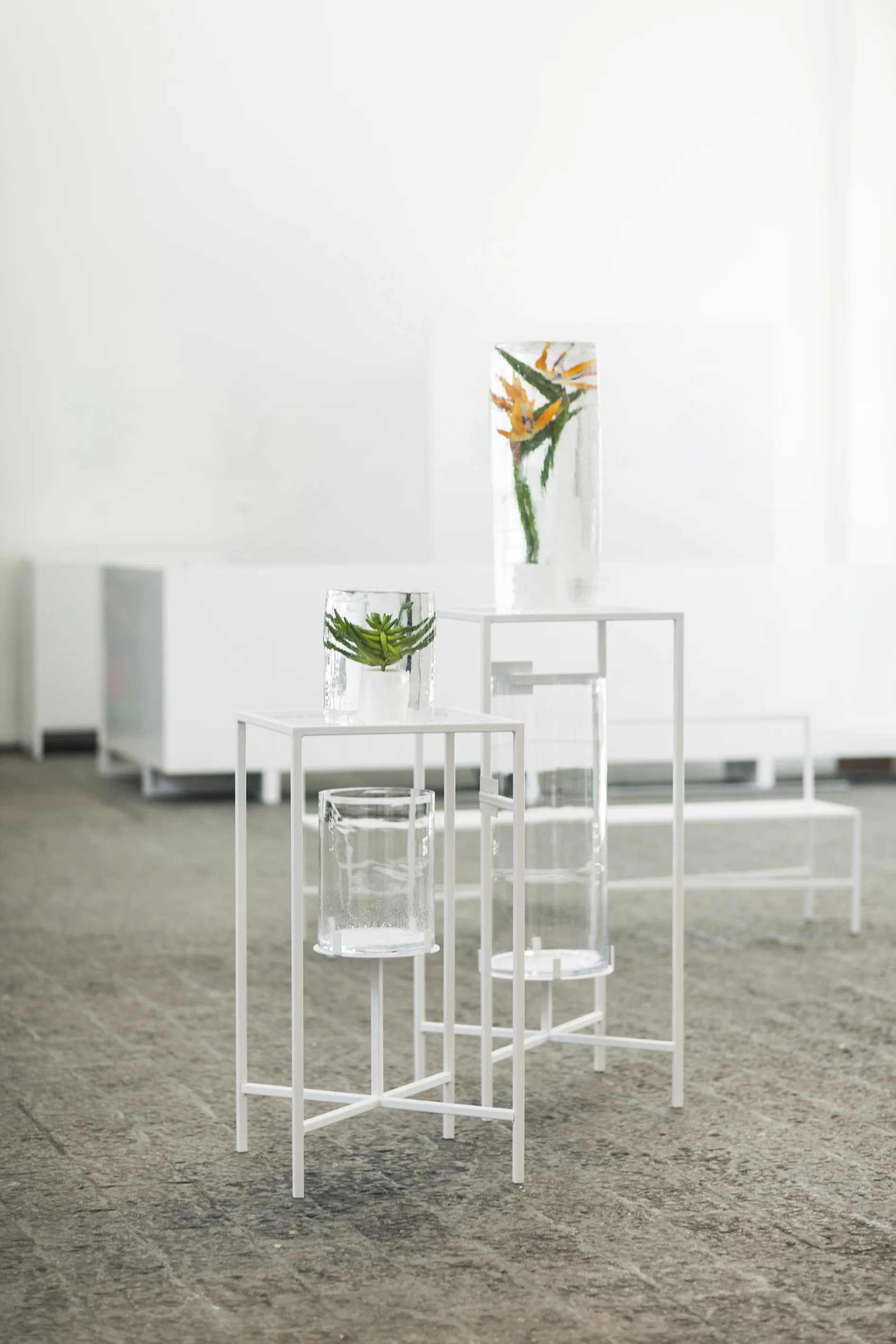
A conceptual representation of temperature for Milan Design Week 2014. Visitors were invited to participate in an immersive laboratory of hot and cold where they encountered a series of multi-sensory artistic and sculptural installations that “give shape” to air. Among the works exhibited, a kinetic installation in which moving illustrated feathers evoke the seasonal migration of exotic birds; meanwhile, tropical plants take shape in a series of ice compositions creating a path throughout the space. Venus and Neptune, respectively the hottest and coldest planets in the Solar System, become the inspiration for an acoustic experience, built from sampling the climatic sounds of these contrasting planets.
HOT & COLD
Client: Daikin
Date: April 2014
Credits: Fabrica Design Team
A conceptual representation of temperature for Milan Design Week 2014. Visitors were invited to participate in an immersive laboratory of hot and cold where they encountered a series of multi-sensory artistic and sculptural installations that “give shape” to air. Among the works exhibited, a kinetic installation in which moving illustrated feathers evoke the seasonal migration of exotic birds; meanwhile, tropical plants take shape in a series of ice compositions creating a path throughout the space. Venus and Neptune, respectively the hottest and coldest planets in the Solar System, become the inspiration for an acoustic experience, built from sampling the climatic sounds of these contrasting planets.
OBJET COLORE
Client: United Colors of Benetton
Design: Fabrica Design Team
Photography: Emanuele Tortora
Date: December 2012
Objet Coloré is a retail display system for United Colors of Benetton, by Fabrica Design Department. The project is a way of distilling the values of Benetton into store furniture that highlights and complements apparel and accessories. The systematic approach allows different elements of collection to combine and scale across window and in-store situations.
OBJET PREFERE
Client: Grand Hornu Images
Design: Fabrica Design Team
Photography: Gustavo Millon
Date: May 2011
A knife, train journeys, a brooch, a beer glass and a book collection are just some of the revealing objects that have inspired Objet Préféré, a unique collection, comprising 15 installations, was created following a workshop between the Fabrica design team and the staff – craftsmen, technicians, office workers – of the Grand-Hornu Images cultural centre in Belgium. Site Visits, interviews and photographic sessions on the theme "Favourite Objects" or “Objet Prefere” led to the creation of 15 narrative artefacts that were made for, with and about the Grand-Hornu Images staff themselves. The resulting site-specific exhibition challenges notions of curation and the role a museum can play as a holistic resource from inspiration through to making.