
DEPOP HQ ENTRANCE FURNITURE
Client: Depop
Design: Dean Brown
Photography: Tian Khee Siong
Date: April 2019
A custom furniture series to furnish the entrance area of the Depop global headquarters in East London. The bespoke collection combines a no-nonsense approach to functionally with a strong sense of brand storytelling and includes a Reception Desk, Storage Cabinets, Bookshelf, Packing Station, Stool and Outbox.
Created to suit the diverse requirements of a 150 person ‘FashTech’ workplace, with employee expertise ranging from Fashion to Coding. The scale and scope of the office users therefore dictated an inclusive and simple design language that strikes a balance between cultural and industrial. Manufactured in powder-coated steel and ash wood the items embody the visual language of the Depop brand through the predominant use of bright red, interspersed with touches of black.
Designed to work within the Depop brand guidelines, the furniture was conceived as a physical extension of the App - inspired by the idea of an infrastructural layer or framework to create within. Overall the project challenges the empty anonymous corporate entrance hall that feels disconnected from the identity of a company, and instead establishes the Depop entrance area as an authentic and useful part of the workplace.

SOMETIMES KITCHEN
Client: Schloss Hollenegg for Design
Curator: Alice Stori Liechtenstein
Photography: Simone Sandahl
Date: May 2019
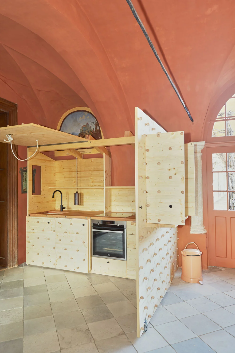
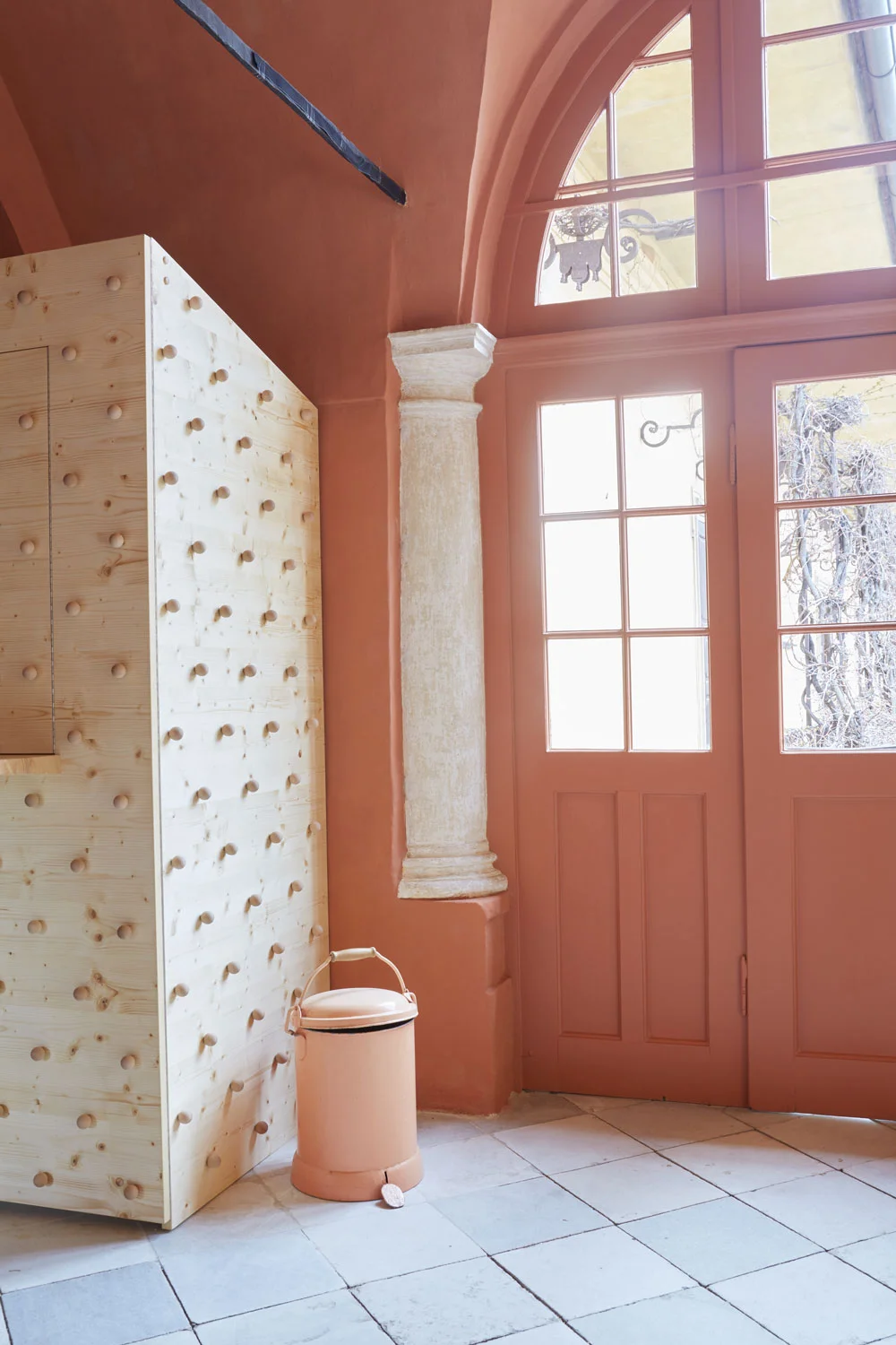
The kitchen is presented as a transformable unit that offers the potential to be useful when it needs to be, and hidden when it’s not. Constructed from local Austrian ‘abete’ timber it elevates the essentials through pleasing and novel opening and closing techniques.
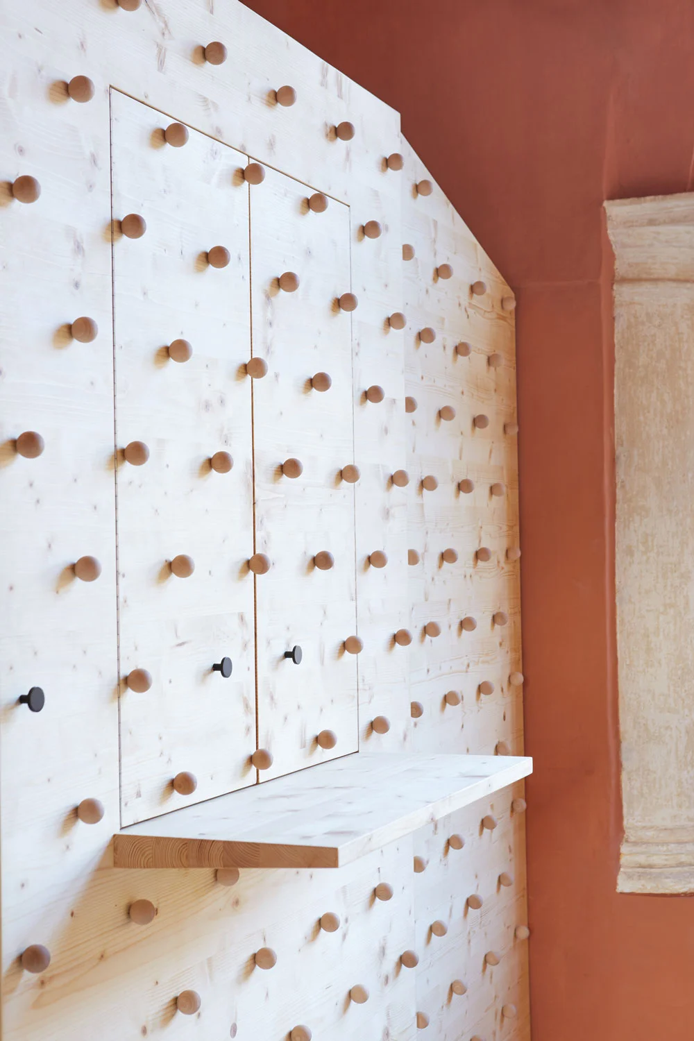
Located within the castle’s guest turret it reveals its purpose through a series of horizontal and vertical doors and hatches that offer a degree of flexibility between open and closed. The largest door creates a room dividing effect, with the smaller doors within the door functioning as a serving hatch or small breakfast bar. An open-top roof raftered roof brings in natural light and views to the ceiling frescoes of the surrounding room. The highly textured exterior surface is composed of over 150 wooden spheres arranged in a lozenge shaped grid composition. Door handles, ropes and wheels punctuate the surface pattern, as a tactile invitation to manoeuvre the abstract exterior and reveal an inner purpose.
The transformative nature of the kitchen creates a destination and openness when the kitchen is in use. When not in use it becomes a closed cabinet - the vibrant internal clutter of appliances and ingredients taking the viewer by surprise as a cupboard becomes a canteen. Overall ‘Sometimes Kitchen’ acknowledges the ritual of cooking & eating as an occasion that is befitting of a change in perspective.

THE ARCHIVE & THE RUMPELKAMMER
Client: Schloss Hollenegg for Design
Curator: Alice Stori Liechtenstein
Photography: Federico Floriani
Date: May 2016
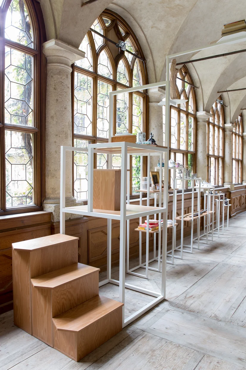
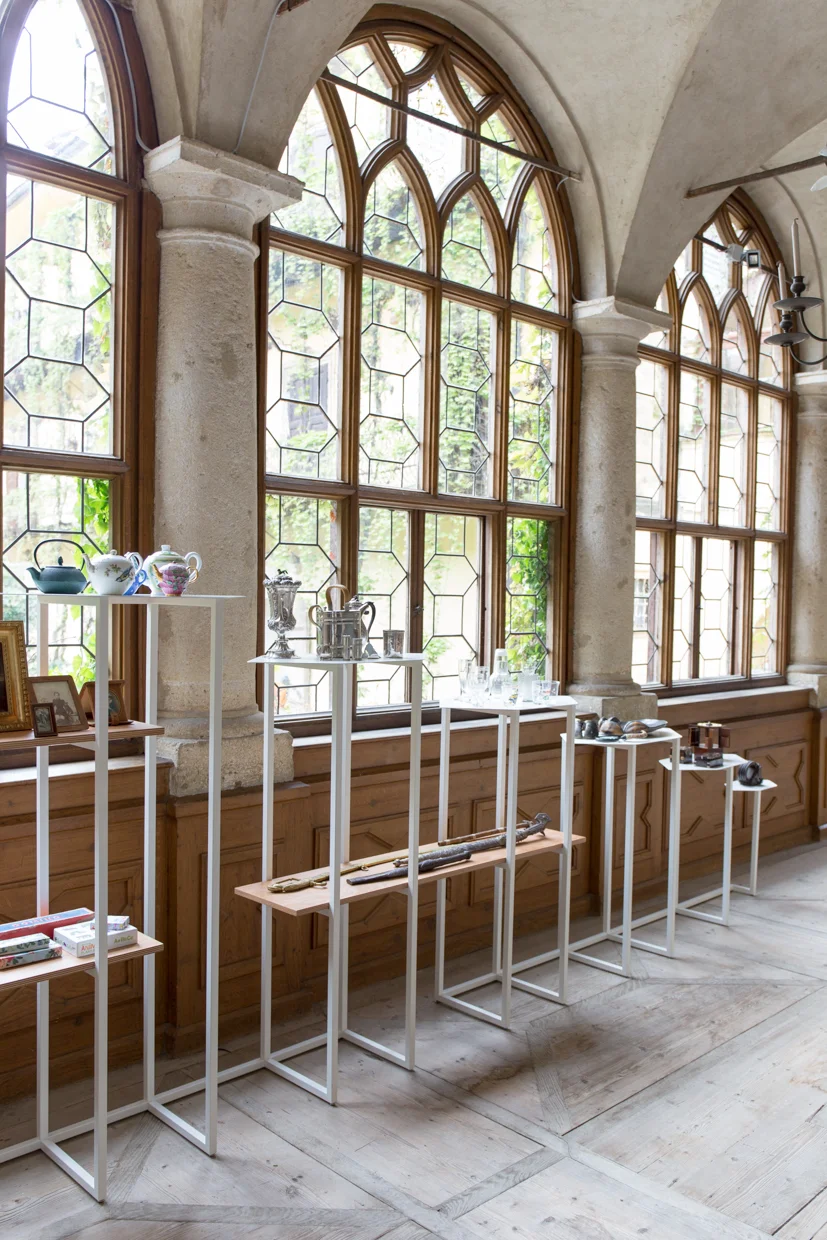
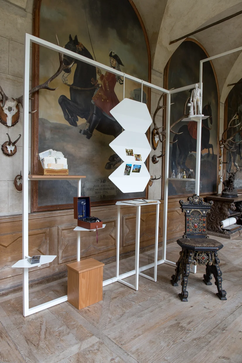
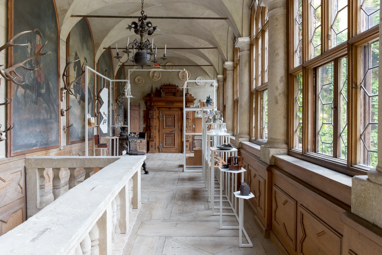
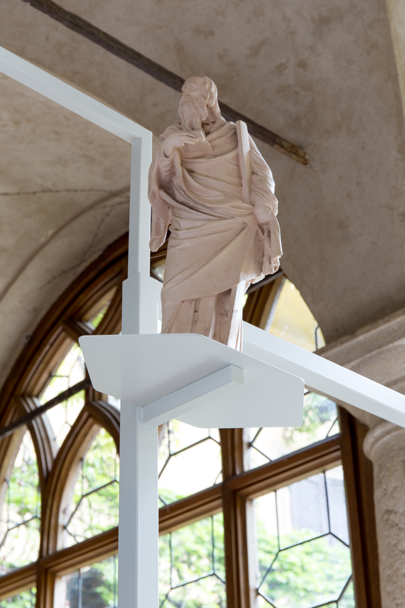
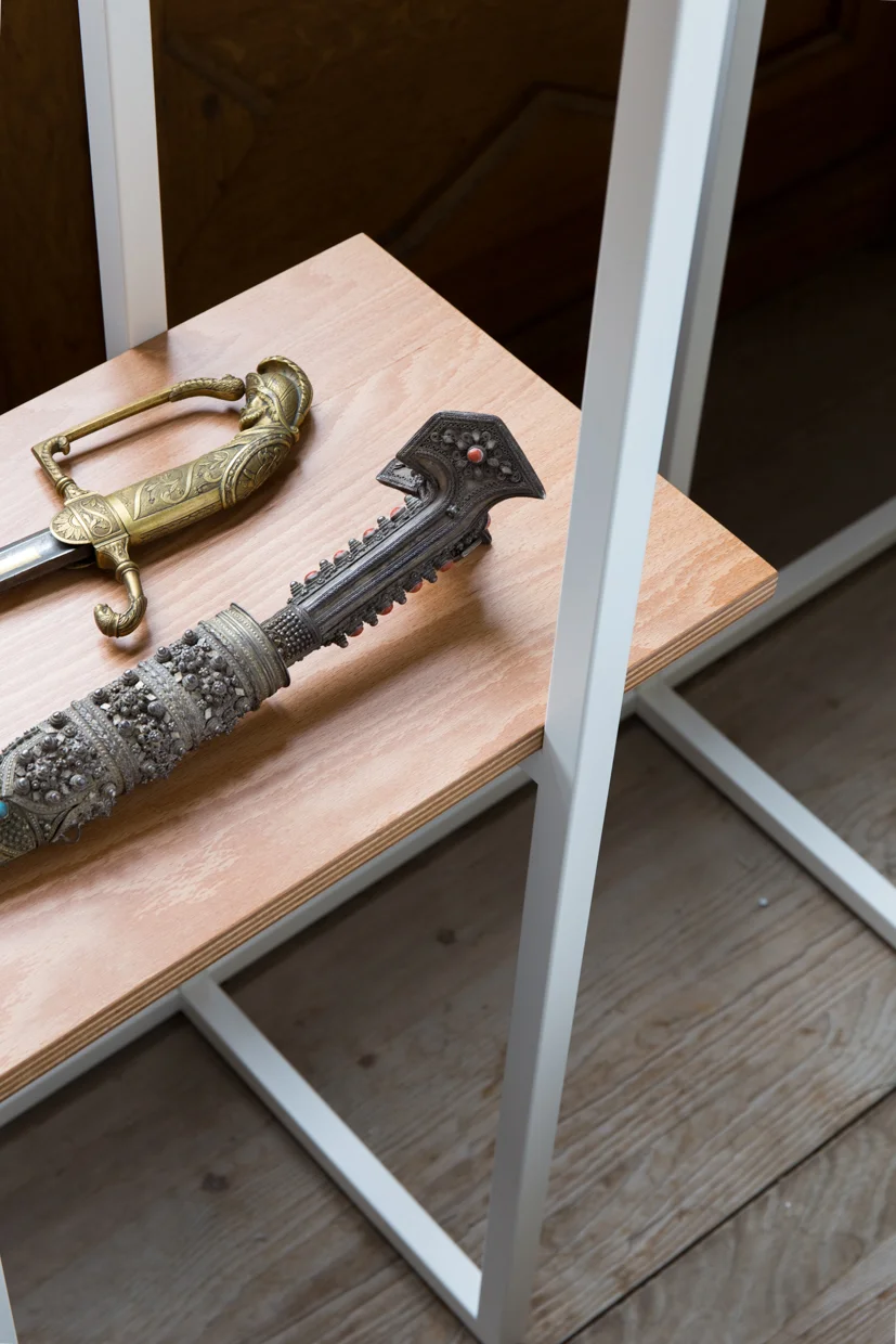
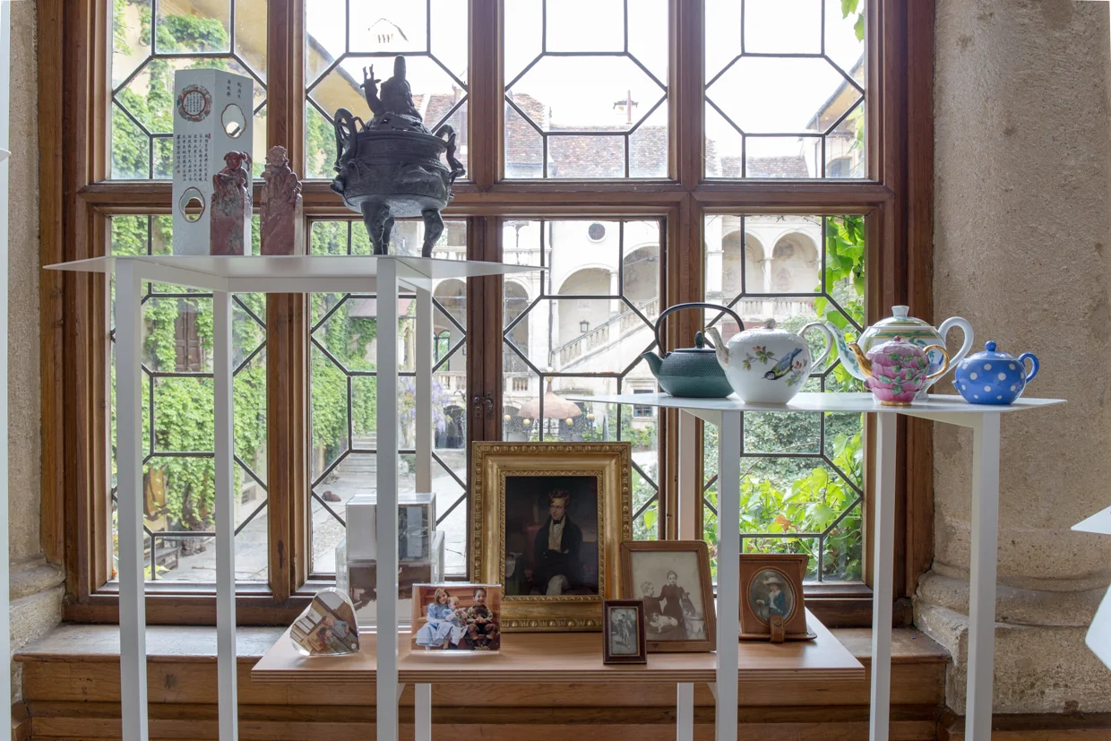
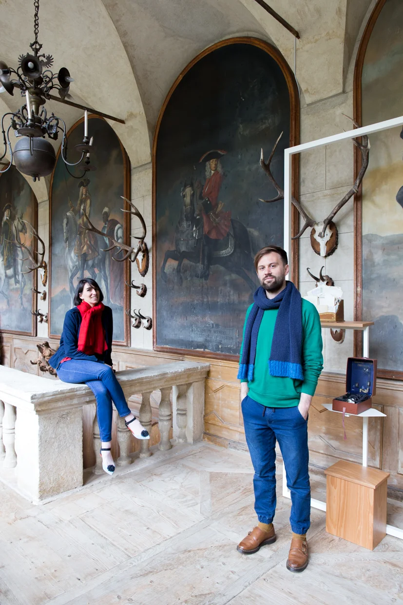
The Archive and the Rumpelkammer is an interior installation for showcasing the vast and varied treasures of Schloss Hollenegg. It is born out of the desire to visualise the complex and layered history of a 10th century castle and its inhabitants. It is inspired by two ways of thinking about conservation in an attempt to portray an abstract time line through tangible objects.
The notion of the ‘archive’ is an organised and chronological approach to displaying things, that has a clear time hierarchy and defined sections to present objects as historical artefacts. The ‘rumpelkammer’ by contrast is eclectic, chaotic and fluid. At the centre of the work is a small elevated desk and stool, allowing an individual to dwell and think within a surrounding of inspiring artefacts, old and new.

ON POINT
Client: Victoria & Albert Museum
Project Partner: Royal Academy of Dance
Design: Dean Brown & Jon Abbott
Photography: Tian Khee Siong
Date: May 2020
On Point is a free display at the V&A which charts the hundred-year history of the Royal Academy of Dance. The 230sqm display runs across three rooms of the V&A’s Theatre and Performance galleries, showcasing objects, costumes, AV projections, original prints and reproduction images.
Designers Jon Abbott and Dean Brown worked collaboratively to present a vision for the display, which was inspired by visual representations of movement. The design concept centres around the concept of the line, from the parallel lines of a musical stave to the physical line of a dancer (the classical ballet term line describes the complete outline of a dancer’s body while performing steps or poses).
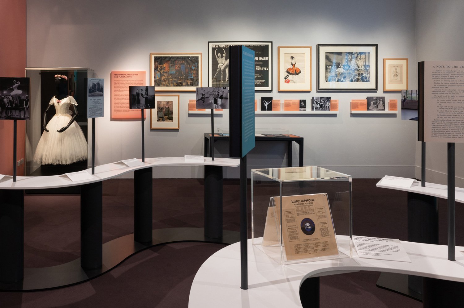
Within the display, the concept of the line is expressed through a number of design features. Firstly, a series of narrow mounted display shelves evoke the form of a ballet training barre, and nods to the horizontality of a musical score. These shelves, or wall lines, have a sense of controlled movement, and serve as a versatile display system on which an array of imagery and captions can be slotted into grooves within the line profiles. The wall mounted showcases dialogue with the wall lines, retaining the same thickness and visual purity, uninterrupted by visible fixings.
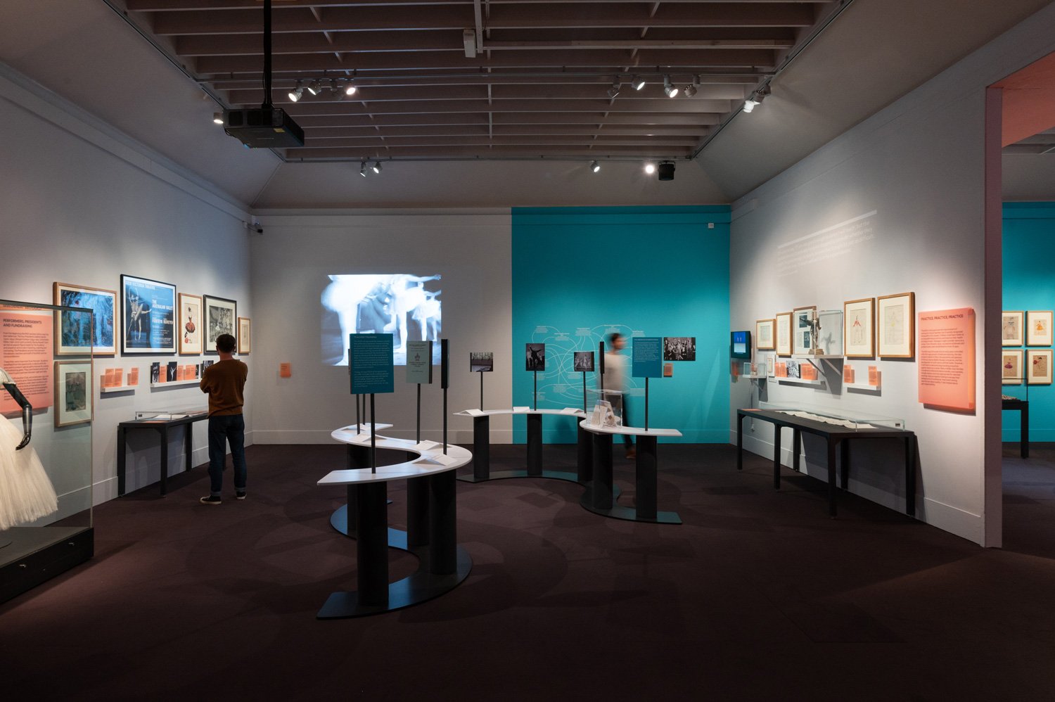
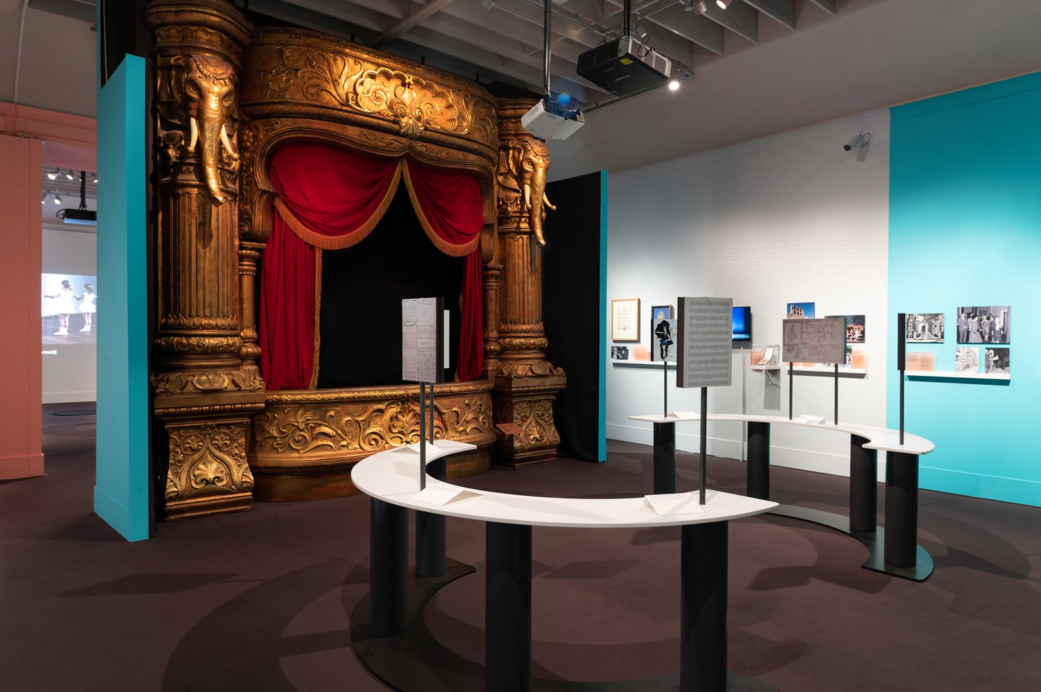
The second design gesture to reference the line motif is a series of linear tables. These six tables are positioned in pairs in the centre of each of the three rooms. The tables are more curvaceous and fluid in form than the wall lines, and create an informal sense of zoning and spatial presence, as well as providing additional display space. The table lines host imagery, poised on narrow stems, and also feature embedded showcases and captions upon the table surface. The linear form of the table is accentuated by dramatic use of white, which contrasts with a dark base and legs that appear to recede into the floor.
Around the half-way point in the display the visitor encounters a ballet studio area, which is recreated with a sprung floor, full height mirror and double barre set at the regulation height of 1150mm. From the inception of the project, through concepting and curatorial discussions, there was a strong sense that a display focussed on dance should offer visitors the opportunity to dance. Whilst at the barre, visitors can attempt to recreate classic ballet poses, guided by an RAD video, showcasing excerpts of the Academy’s ballet syllabus.
The colour palette nods to a colour often associated with ballet, pastel pink, which is offset by a contemporary use of teal and grey. The colours are applied as boldly contrasting blocks throughout the three rooms of the display. Pastel pink reappears in the form of frosted acrylic captions and sections intros, whilst a number of super graphics provide a life-size look into the history of the RAD.
The design of the display aims to balance the rich history of the organisation with its contemporary approach to ballet and dance. It does so by evoking a sense of movement with a modern attitude and refined design details – celebrating the past and present of the Royal Academy of Dance with an eye on its enduring relevance in the future.

ON POINT
Client: Victoria & Albert Museum
Project Partner: Royal Academy of Dance
Design: Dean Brown & Jon Abbot
Photography: Tian Khee Siong
Date: May 2020
On Point is a free display at the V&A which charts the hundred-year history of the Royal Academy of Dance. The 230sqm display runs across three rooms of the V&A’s Theatre and Performance galleries, showcasing objects, costumes, AV projections, original prints and reproduction images.
Designers Jon Abbott and Dean Brown worked collaboratively to present a vision for the display, which was inspired by visual representations of movement. The design concept centres around the concept of the line, from the parallel lines of a musical stave to the physical line of a dancer (the classical ballet term line describes the complete outline of a dancer’s body while performing steps or poses).
Within the display, the concept of the line is expressed through a number of design features. Firstly, a series of narrow mounted display shelves evoke the form of a ballet training barre, and nods to the horizontality of a musical score. These shelves, or wall lines, have a sense of controlled movement, and serve as a versatile display system on which an array of imagery and captions can be slotted into grooves within the line profiles. The wall mounted showcases dialogue with the wall lines, retaining the same thickness and visual purity, uninterrupted by visible fixings.
The second design gesture to reference the line motif is a series of linear tables. These six tables are positioned in pairs in the centre of each of the three rooms. The tables are more curvaceous and fluid in form than the wall lines, and create an informal sense of zoning and spatial presence, as well as providing additional display space. The table lines host imagery, poised on narrow stems, and also feature embedded showcases and captions upon the table surface. The linear form of the table is accentuated by dramatic use of white, which contrasts with a dark base and legs that appear to recede into the floor.
Around the half-way point in the display the visitor encounters a ballet studio area, which is recreated with a sprung floor, full height mirror and double barre set at the regulation height of 1150mm. From the inception of the project, through concepting and curatorial discussions, there was a strong sense that a display focussed on dance should offer visitors the opportunity to dance. Whilst at the barre, visitors can attempt to recreate classic ballet poses, guided by an RAD video, showcasing excerpts of the Academy’s ballet syllabus.
The colour palette nods to a colour often associated with ballet, pastel pink, which is offset by a contemporary use of teal and grey. The colours are applied as boldly contrasting blocks throughout the three rooms of the display. Pastel pink reappears in the form of frosted acrylic captions and sections intros, whilst a number of super graphics provide a life-size look into the history of the RAD.
The design of the display aims to balance the rich history of the organisation with its contemporary approach to ballet and dance. It does so by evoking a sense of movement with a modern attitude and refined design details – celebrating the past and present of the Royal Academy of Dance with an eye on its enduring relevance in the future.

ON POINT
Client: Victoria & Albert Museum
Project Partner: Royal Academy of Dance
Design: Dean Brown & Jon Abbott
Photography: Tian Khee Siong
Date: May 2020
On Point is a free display at the V&A which charts the hundred-year history of the Royal Academy of Dance. The 230sqm display runs across three rooms of the V&A’s Theatre and Performance galleries, showcasing objects, costumes, AV projections, original prints and reproduction images.
Designers Jon Abbott and Dean Brown worked collaboratively to present a vision for the display, which was inspired by visual representations of movement. The design concept centres around the concept of the line, from the parallel lines of a musical stave to the physical line of a dancer (the classical ballet term line describes the complete outline of a dancer’s body while performing steps or poses).
Within the display, the concept of the line is expressed through a number of design features. Firstly, a series of narrow mounted display shelves evoke the form of a ballet training barre, and nods to the horizontality of a musical score. These shelves, or wall lines, have a sense of controlled movement, and serve as a versatile display system on which an array of imagery and captions can be slotted into grooves within the line profiles. The wall mounted showcases dialogue with the wall lines, retaining the same thickness and visual purity, uninterrupted by visible fixings.
The second design gesture to reference the line motif is a series of linear tables. These six tables are positioned in pairs in the centre of each of the three rooms. The tables are more curvaceous and fluid in form than the wall lines, and create an informal sense of zoning and spatial presence, as well as providing additional display space. The table lines host imagery, poised on narrow stems, and also feature embedded showcases and captions upon the table surface. The linear form of the table is accentuated by dramatic use of white, which contrasts with a dark base and legs that appear to recede into the floor.
Around the half-way point in the display the visitor encounters a ballet studio area, which is recreated with a sprung floor, full height mirror and double barre set at the regulation height of 1150mm. From the inception of the project, through concepting and curatorial discussions, there was a strong sense that a display focussed on dance should offer visitors the opportunity to dance. Whilst at the barre, visitors can attempt to recreate classic ballet poses, guided by an RAD video, showcasing excerpts of the Academy’s ballet syllabus.
The colour palette nods to a colour often associated with ballet, pastel pink, which is offset by a contemporary use of teal and grey. The colours are applied as boldly contrasting blocks throughout the three rooms of the display. Pastel pink reappears in the form of frosted acrylic captions and sections intros, whilst a number of super graphics provide a life-size look into the history of the RAD.
The design of the display aims to balance the rich history of the organisation with its contemporary approach to ballet and dance. It does so by evoking a sense of movement with a modern attitude and refined design details – celebrating the past and present of the Royal Academy of Dance with an eye on its enduring relevance in the future.
RE:COLLECT
Client: Museum of the Home
Curation: Amy Foulds & Louis Platman
Exhibition Design & Identity: Brown Office
Object Photography: Theo Deproost
Exhibition Photography: Laura Blair
Date: May 2022
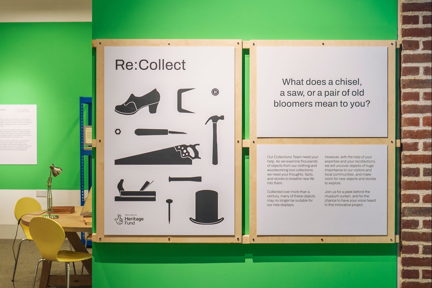
The design of Re:Collect exhibition takes inspiration from a museum archive, and invites visitors to experience the behind the scenes activities of a Museum collections team.
Central to this idea is an archive shelving system capable of hosting a vast array of museum artefacts, numbering in their thousands over the course of the exhibition. This distinctive exhibition feature framed an interesting design challenge - to create a flexible and responsive display solution capable of hosting hammers, top hats, chisels, ball gowns and everything in between. The colour palette of the display, featuring industrial blue racking and bright green colour blocking, established a bold point of difference from the historical objects.
The graphic identity continues the notion of an archive - referencing museological standards including diagrams, labels, and a plug and play caption system allows object descriptions to be frequently removed and replaced using paper archive labels and magnetic fixings.
As well as the collection objects themselves, within the space the tools and methods of collecting are laid bare around a dedicated study table where visitors can comment on objects that have value to them, as well as understand the stages an object goes through from acquisition to disposal, depicted in the 'Life of an Object' infographic.
In response to the theme of re-collecting, and a commitment to sustainable practice more generally, the strategy prioritised reuse, where all of the main display elements will be repurposed beyond the exhibition. Therefore the design decisions focused on sourcing and elevating ‘standards’, as opposed to bespoke manufacture, and re-appropriated existing museum furniture where possible.
Overall Re:Collect strives to lift the curtain on how museums collect, and consider the future of their collections, in an authentic, joyful and participatory manner.

BENETTON GROUP OFFICE INTERIOR
Client: United Colors of Benetton
Furniture Design: Dean Brown (Fabrica)
Graphic Design: Catarina Carreiras (Fabrica)
Photography: Marco Zanin
Date: July 2014
A vibrant and eclectic Office Interior for the Benetton Group’s communication team, comprising a custom furniture collection, graphic interventions and a large-scale wall composition mixing past and present United Colors of Benetton campaigns and cultural artefacts. The interior was sensitively composed to compliment the mood of the original Tobia Scarpa architecture, introducing a brighter palette of colours and a diversity of private / communal working areas.
HQ Entrance Furniture, Depop


Sometimes Kitchen, Schloss Hollenegg


The Archive & The Rumpelkammer, Schloss Hollenegg


On Point, Victoria & Albert Museum


Re:Collect, Museum of the Home


Office Interior, United Colours of Benetton


